A Design Overview of VR Titles
I’ve got access to an HTC Vive recently thanks to Kibu and I spent my past few weeks playing most of the games available. In this post I’ll share what I’ve learned from playing these games and watching others play them. I’ll walk around the different design solutions in these games especially applied to the Vive.
The Gallery — Episode 1: Call of the Starseed (19,99€)
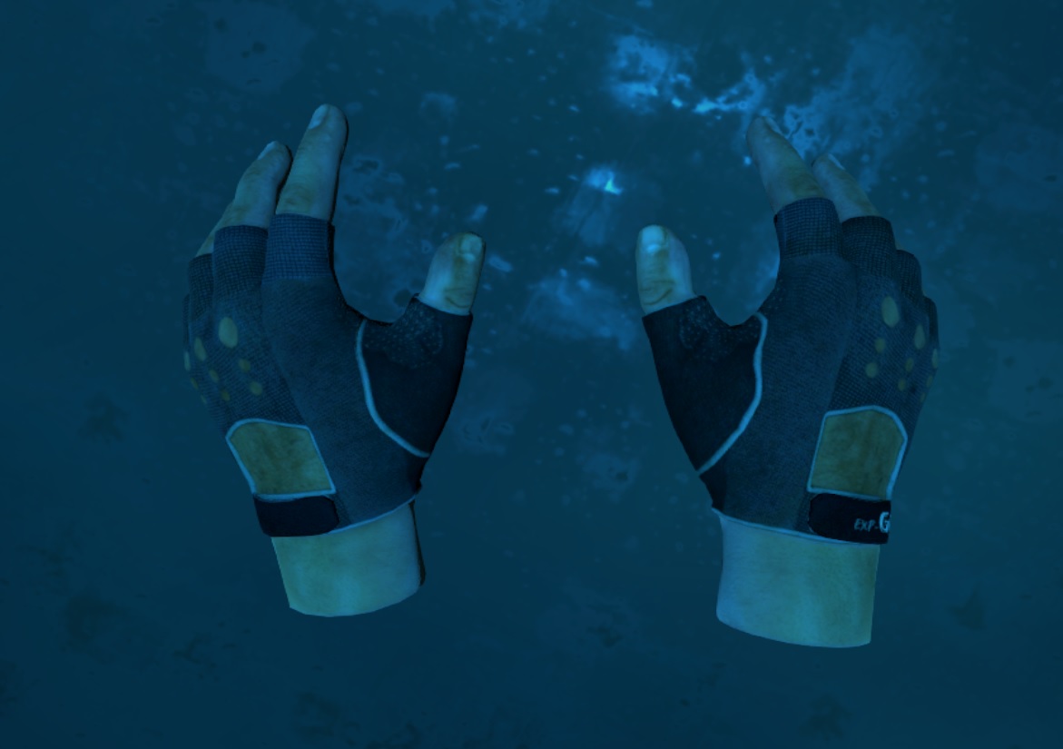
+ Hands instead of controllers: This is the first game I see “my” hands in instead of the controllers. This nicely blends into the environment and adds a bit more realism. You can close your hands and pick up objects by pressing the trigger on the controller and it feels natural. And there is even a separate hand animation for each object that you can hold.
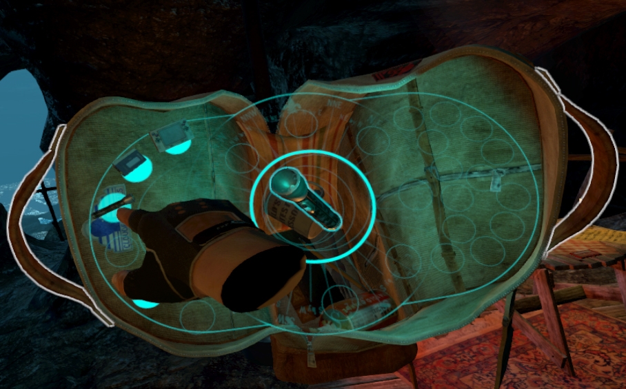
+ Inventory system: When you want to use an item from your inventory you don’t have to open a flat window but rather you pull out a backpack over your shoulders.
This is a genius way to manage your items. You need something? Pull out your backpack and take it out. Don’t need it any more? Put it over your shoulder as if there was a real backpack.
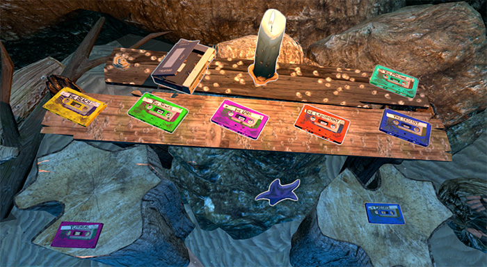
+ Loading Menu: Every time you reach a checkpoint a new cassette will be appear on the table at the start of the game. You can load the selected checkpoint by putting the corresponding cassette into the player.
+ Collision: If you have a large enough play space or the map isn’t rectangular you can walk through walls or look beyond them. This is a problem I have encountered in every other game. Here this is solved by blurring your vision as you go deeper into the material so that you don’t see unintentional things. When you go deep enough you will get teleported back to a traversable area.
+ Persistent bounds: For me this is a very useful feature because I’d rather see the bounds of the room on the floor at all times so that I avoid seeing the grid which is super annoying.
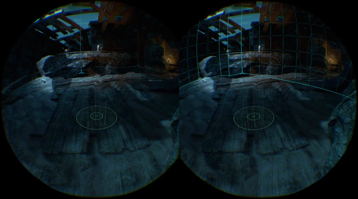
+ Interactivity: There are a lot of objects in the world that you can grab and interact with. This can significantly increase the time the player spends in a map. 🙂
Here are some of these cool interactions:
- Lighting the fireworks
- Burning the letter
- Cooking popcorn on the camp fire
- Putting the tape in the cassette player
- Hearing the ocean in the shells
- Shaking the glow stick to activate
– Limited Interactions: However in a game where you can do so much, you get used to it and there will be some things you cannot do. These tiny things can easily break the illusion of reality. Of course everything can’t be imitated from the real world but most of these obvious things can:
- Log in campfire doesn’t burn but gets pushed out
- Interactive candle next to non-interactive candle
- Ringing the bell by throwing objects at it is not excepted in quest only shooting
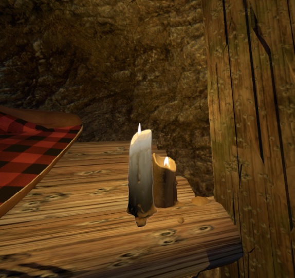
– Auto height change: When you are walking around and the terrain changes beneath you the game changes the camera height to keep a constant distance from the ground. This may sound like a good idea but a lot of people get sick from this very quickly. This is caused by the difference between what your body feels and what your eyes see.
With the recent patch most of the issues were resolved but walking up the stairs will still get you nauseous. The height change is simply too large while you are walking on a flat floor.
The Lab (free)
This is kind of an official tutorial for the headset by Valve. It contains 8 minigames exploring different aspects of VR. All of them is very high quality so I’ll only talk about the most interesting ones.
+ Scale: From the outside I thought these rooms were bigger but when I tried them out I was amazed how small they were compared to my expectations and it felt a lot better. It is important to test and develop everything in the headset even if it looks right on the monitor.
+ eSport: These two rooms require a lot of movement which can be considered real eSport in a way. This is welcome since most of the gamers don’t move enough. As a result you will start to sweat pretty soon which can ruin the gaming experience. I recommend using a strong fan directed at the game space which will help you orient in the room too.
+ Directing attention: At the first part of this demo you have to find different objects in the room and interact with them. The game will wait for you and the big lamp hanging from the ceiling will point you to the right direction.
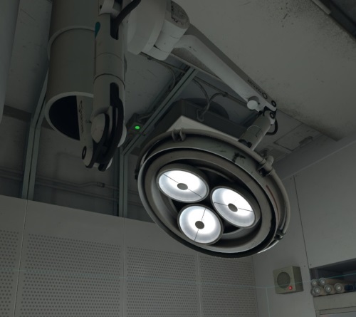
– Directing attention: At the end however you only have a couple of seconds to look around the room and figure out what to look at. As a result most of the players miss out on the ending including sometimes myself after playing it a dozen times. Here the light doesn’t help because it disappears almost instantly. A good solution would be to only start this “cutscene” when the player faces the correct wall.
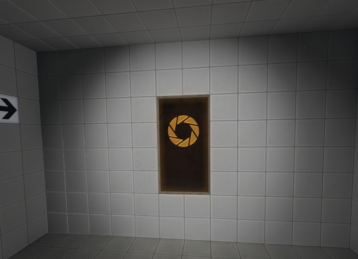
+ Navigation: The teleportation is disabled on slopes and the camera height stays constant even when you walk to higher or lower areas in-game. This is usually not very distracting for small terrain differences. In addition I would add a feature when this difference exceeds a threshold the player would be automatically teleported to the new altitude.
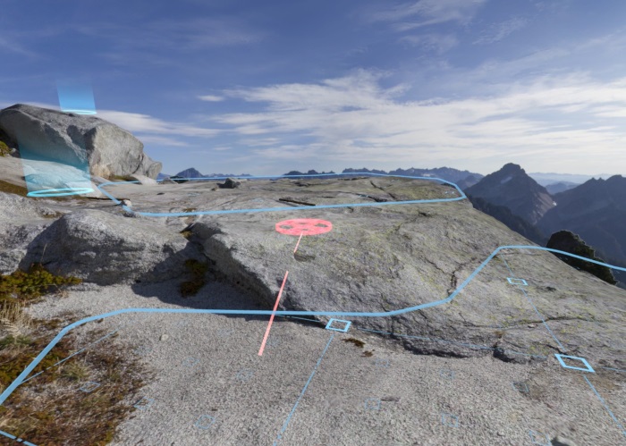
The problem is with smooth motions, slow but sudden changes when the view fades into black and then the new location is working fine just like the teleport in the lab or the “blink” in The Gallery.
Portal Stories: VR (free mod)
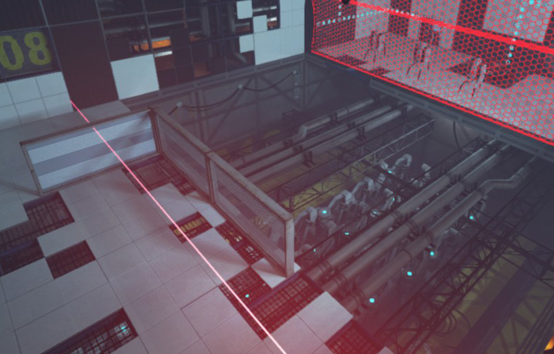
+ Physical dimension: The glass panes are so high that they only cover the legs but when you crouch the turrets can’t shoot you. This is a different kind of movement which is evident in the real world but here we have to figure it out ourselves which adds another level of realism.
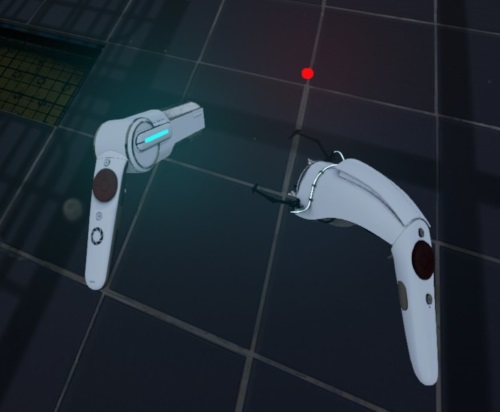
+ Teleporting: In this game teleportation is a game mechanics. You get two devices which strongly resemble the controllers but look a lot better. With one you can teleport yourself around and with the other you can grab objects. While it is a good method for this game it would be boring to see this technique in every game.
+ Elevator ride: As opposed to stairs, elevator rides are working without a problem. Provided that there is a fix frame at the edges of the screen which the player can look at during the ride. A possible explanation is that since our vertical motion as human beings is limited the brain didn’t develop enough to sense vertical motion as precisely as horizontal motion.
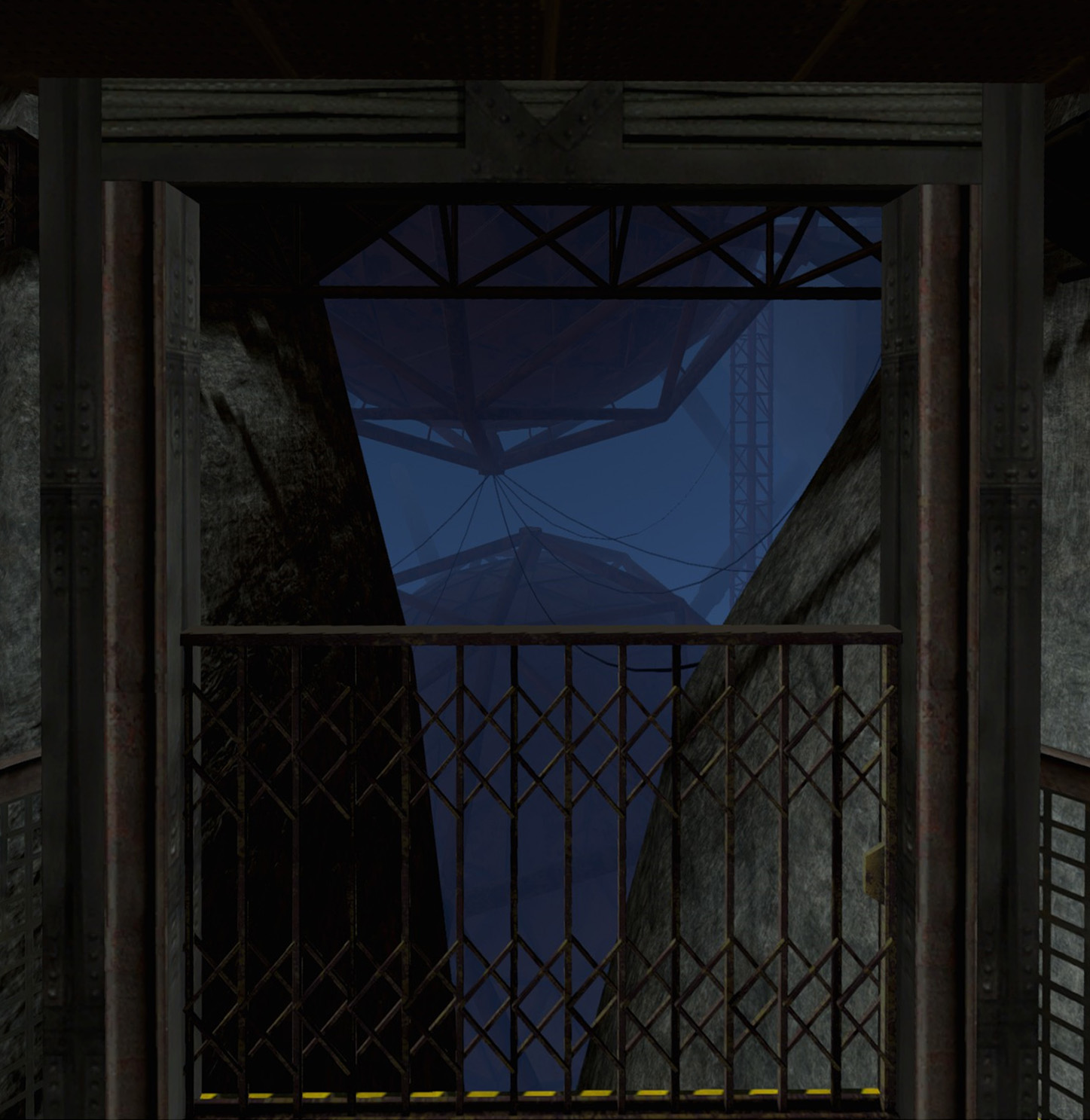
My big question is whether ladders are working and if so how to implement them.
– No collision: Because you can simply walk through walls you don’t even need to solve any tests to beat the game.
AltspaceVR (free)
– In-game 2D UI: For dynamic content like a server list 2D UI is a good choice especially when it’s projected on a 3D surface: In the Welcome Space there is a table on the wall with similar information. The execution however is poor. The buttons themselves are not small but when you point at them they rarely get triggered making it extremely frustrating to use.
– Movement: My first thought was when I saw the controllers is how easy walking could be implemented. Just use the touchpads to move around. It may be that easy on a Cardboard but definitely not on the Vive with Roomscale. It feels as if you are sliding while you are standing still and you just want to teleport instead and never try this again. This is a similar problem to walking up a slope I talked about earlier.
+ Social platform: This is an international meeting place. My favourite moment is when a guy from France and a girl from Japan were talking to each other in Japanese. It is not only good for practicing languages but also to meet different people from all around the world. You can walk around freely and feel the other people’s presence but not in an overwhelming way. You can use hand and head gestures which make it a lot more interesting than a chat conversation. Imagine the possibilities of an online co-op game or a VRMMORPG (SAO) …
Trials on Tatooine (free)
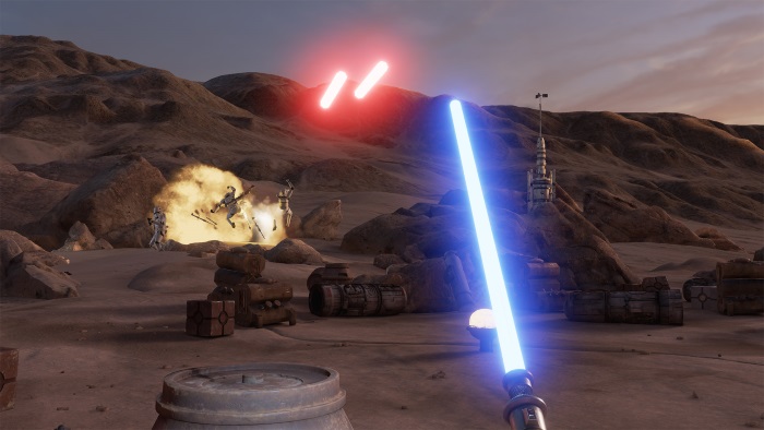
This is a short experiment where you can “Repair the Millennium Falcon, defend it from attack by Imperial Stormtroopers, and wield a LIGHTSABER”. This leaves a big impression because it’s Star Wars otherwise it’s too short.
+ Lightsaber: The lightsaber is really well made, when you swing it you feel as if it was the real thing. This is achieved with the combination of sound and force feedback.
+ Scale: When the Millenium Falcon lands in front of you, you start taking steps back because you are afraid it would crush you. The fact that a Virtual Reality experience makes you feel things like this (physical danger) is astonishing.
– Not much to do: This experiment is more like an interactive movie than a game, which is generally not a bad thing. But in this case you are restricted in what you can do. There is a big map in front of you and you can’t explore it.
Summary
- Hands instead of controllers
- Interaction with objects is important
- Persistent bounds and center mark can be useful but might be distracting for some
- Prevent players from going through walls
- Avoid 2D interfaces where possible and use 3D scenes and objects instead
- No auto height adjustment
- No walking with touchpads
- Elevator rides are working when there is a static frame to look at
- Only start cutscenes when the players are guaranteed to be looking